

")

")


Whether you have a DIY website or a professional website you love—but wish the conversion rate was just a bit higher—you’re going to love this episode and want to listen all the way through. In the online space, we often talk a lot about logos, color palettes, and simply getting something online when we’re starting our businesses. But I believe our websites should do much more for us. So let’s talk about how to improve your website!
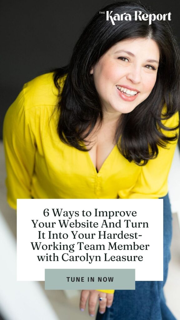
Today, I’m joined by Carolyn, who completely agrees. She’s bringing six ways to turn your website into your hardest-working team member. I love that! You’ll definitely want to hear all six tips, and stick around after that because we also dive into ethical marketing, zero-party data, and how Carolyn has grown her business without relying on social media. You know I was all over that topic.
Carolyn Leasure, Website Evolution Expert, turns frustrating starter sites into sexy systems that work better for everyone. At Maypop Creative Studio, she creates beautiful, seamless sites that do the heavy lifting. Because she believes that your brand, design + tech should work for you – not the other way around.
Carolyn calls the mountain town of Charlottesville, VA home. When not constructing seamless automations or copy-driven web design for clients, she can be found playing Himalayan Sound Bowls for a meditation shortcut, or splashing and whooping down the Rivanna River in an inner tube with her husband and two sons.
This interview—can you already tell?—is going to be so much fun. I absolutely loved this conversation. As always, I record these intros after the interview, and it was such a joy listening back because, during the conversation, I was literally hanging onto every word Carolyn said. You’re going to love this conversation on how to improve your website just as much as I did.
Listen on Apple | Listen on Spotify
Table of Contents
Who is Carolyn Leasure of Maypop Creative Studio?
My name’s Carolyn. I run May Pop Creative Studio. This is actually my second career—I started about five years ago. My goal is to create websites that charm the pants off visitors and work their butts off behind the scenes. I mostly work with solopreneurs, coaches, and small businesses. As a website evolution expert, I help transform starter sites into seamlessly branded systems, freeing up more time for my clients to focus on whatever they want to be doing.
What is a “business card website”?
It’s really easy to get stuck in the mentality of having a “social proof” website—especially when you’re just starting out and you just want to get something up there. Basically, it ends up being a pretty business card that says who you are and what you do.
But when you have a website that qualifies leads, books clients, handles your scheduling, and builds your email list, it’s like having a staff member, a VA, or someone at the front desk—rather than just having a site that people visit and say, “Oh yeah, this person looks legit.”
Without that kind of functionality, you end up getting stuck explaining your services in DMs or email threads, manually sending out information, or constantly updating your schedule yourself. And that really pulls you away from spending time in your zone of genius—which is exactly why you got started in the first place.
Now, let’s dive into 6 ways to improve your website!
There are a lot of different things I do as a designer and developer to help make someone’s site more functional (and therefore improve your website), but I wanted to distill it down to six things that someone can do on their own—or at least use as a starting point to check where they currently stand.
I also have a link I can share at the end that outlines everything I’m covering here. You can choose whether you want it as a PDF or a Notion doc. It’s a free checklist, so if you don’t remember everything we’re talking about right now, you can easily go back and reference it later. The checklist gives more of a high-level overview rather than super specific recommendations for integrations or tech.
1. Have a Clear Navigation
So, the first one is something that can feel really overwhelming when you’re just starting out with your website: clear navigation.
There’s a UX (user experience) law called Hick’s Law, which basically proves that the more choices you give someone, the longer it takes for them to decide—and the more likely they are to give up altogether.
I always think of a personal example: one time I had sinus pain and wasn’t feeling great. I went into CVS and saw an entire wall of medications. There were so many options that I got completely overwhelmed and walked out with nothing. That’s exactly what Hick’s Law is about.
If your website navigation is cluttered or unclear about where each link goes, it’s not only bad for Google and SEO, but it also creates decision paralysis for your visitors. And that’s not what you want.
Practical tip:
Limit your main header navigation to four or five clear, descriptive links. Don’t try to be clever—just be clear. You can use dropdown menus if you need to include more information, and anything that’s not absolutely critical can go in the footer. (We’ll talk more about the footer next.)
2. A Click-worthy Footer
This is one of the biggest issues I see when I’m redesigning websites and it’s an easy way to improve your website. Either there’s no footer at all, or it just lists the business name and isn’t being used strategically.
A well-designed footer is great for SEO because it appears on every single page of your site. If you include a brand bio written in your brand voice that clearly explains what you do and who you serve, you’re giving search engines more relevant content to work with.
You can also use the footer to house links that don’t need to live in your main navigation—things like resources, freebies, or other helpful content. Because the footer shows up on every page, those links are always accessible without cluttering the top menu.
And don’t forget social links! If you’re a local business, adding your address or general location is really helpful too.
The footer is so often underutilized, but using it strategically really helps separate a simple business card website from one that’s actively working harder for you behind the scenes.
3. Brand Consistency
Okay, this next one is something everyone’s probably heard a million times, but it really does make a huge difference for your website: brand consistency.
When people come to me with their starter site, I often see four or five different fonts being used. On one page, all the buttons might be one color, and on another page, there are four different button colors. Or maybe they’ve rewritten some copy along the way, so the latest sales page sounds completely different from the homepage.
The problem is, when you’re trying to build trust and convey professionalism, inconsistency makes it much harder to connect with your ideal audience. If visitors are seeing something different on every page—whether it’s colors, fonts, or tone of voice—it creates a trust gap.
Brand consistency is important throughout your entire marketing ecosystem, but your website is one place where it’s absolutely critical. Every single page should feel unified in terms of color palette, font choices, brand voice, and even things like button styles or calls to action.
In the handout I mentioned earlier with ways to improve your website, I include a checklist to help you spot these inconsistencies. Brand inconsistency is a common sign of a starter website, but it’s also one of the reasons those sites often struggle to convert as effectively as they could.
And like you said, because you’re so close to it, you might not even notice the gaps. You may be nailing it on one page, but another page hasn’t been touched in three years. Or you’ve updated part of the site but not the rest, and those inconsistencies start to add up.
In the AI age, it’s especially important to build trust—not just with your visitors, but with search engines too. For example, you do Pinterest SEO, and it works similarly for Google and Bing (which powers a lot of AI search results). They’re looking for websites that demonstrate experience, authority, and trust—what’s often referred to as E-A-T. That’s how they decide which sites to recommend.
Having visitors land on your site, stay there, and click around sends positive signals to these platforms and helps build that trust factor even more.
4. Clear Call-to-action
The next way to improve your website is to have a clear call to action.
This is another thing I see a lot—especially as businesses grow. You start in one place, then you add on more services, more offers, more pages—which is fantastic—but sometimes that leads to having multiple calls to action on the same page. When that happens, visitors can get confused and not know where to go or what to do next.
It’s kind of like being in a new city where every sign is pointing you in different directions—it gets overwhelming quickly.
There are two places where having a clear call to action is especially important to improve your website:
- Top right navigation — this is a place people instinctively look for a primary button or action.
- Above the fold — right at the top of the page, before someone starts scrolling.
Sometimes people wonder why websites tend to follow these same structural patterns, but there’s actually a UX law behind it (I’m blanking on the name right now!). Basically, users have a mental model for how websites work, and your site should feel intuitive to navigate based on their past experiences online.
It’s that established paradigm. People expect to find certain elements in familiar places, and your site should honor that.
Now, on your homepage, it’s perfectly fine to have multiple calls to action—like buttons for your About page, Services page, or Contact page—because people may be landing on your site from different starting points.
But on interior pages, you want to have one primary action that you want the visitor to take. Make it super obvious.
So upfront, you need to decide:
- Am I trying to grow my email list?
- Am I enrolling people in a course?
- Am I booking discovery calls?
- Am I getting people to sign up for a service?
Whatever your primary goal is, that should drive your main call to action—and it should be crystal clear to anyone navigating through your site where they’re being guided.
Mapping out your customer journey
The first step I take when I design sites and create briefs is to map out the user journey—basically engineering the pathway a visitor will take through the site so they always end up at that primary call to action.
Now, this isn’t necessarily something you have to DIY—it can be a little more advanced way to improve your website—but if you want to give it a try, absolutely go for it. The idea is to intentionally design the flow of your site so visitors are guided where you want them to go.
For example, on my own site, my goal is for people to go to my Contact page and fill out my discovery form to book a call with me. So every page on my site, in some way, leads visitors toward that goal.
But you also have to think about what information they need before they’re ready to take that step. In my case, they probably want to read about my services first, and before that, they might want to learn a bit about me—who I am and why I’m qualified to help them. So, I reverse-engineer the flow:
- First, the About page.
- Then, Services.
- Finally, Contact.
By designing your calls to action to naturally guide visitors through this progression, you create a much stronger chance of conversion.
Having clear, strategic calls to action like this makes a huge difference. And again, when we’re first introduced to these DIY platforms, no one really teaches you this. I know I certainly didn’t learn about any of this when I built my first website in my previous career.
5. Clear Website Copy
The next way to improve your website is something we touched on a little earlier, and that’s clear website copy.
It’s essential that when someone lands on your site, within the first five seconds, they understand exactly what you do. There’s a balance between writing for search engines, writing in your brand voice, and writing for clarity — all of those elements have to work together. Visitors need to immediately understand who you are, what you offer, and who you serve.
The winning formula for website copy comes down to a few key things:
- Scannable content — break your text into chunks, use short sentences, and make it easy to read.
- Immediately identifiable offer — even if you have multiple services, visitors should quickly grasp what you do.
- Jargon-free language — even if your audience is highly educated, people don’t read websites word for word. And I say that as someone who writes copy for websites—it’s just how people consume content online.
In reality, people scan websites. So writing at a fifth- to seventh-grade reading level is really helpful. There’s actually a website called Hemingway where you can input your copy and it will analyze things like sentence complexity, reading level, and whether you’re diluting your point with unnecessary words. I use Hemingway all the time.
Also, use the exact phrases your clients are actually searching for. That’s like a magnet pulling people to your site. You’re not keyword stuffing — you’re speaking in the words they naturally use.
For example, technically the little picture that shows up in the browser tab is called a favicon, but most people call it a “website icon.” So you want to use the language your right-fit clients are using in their own heads. Combine that with well-structured, concise copy, and you’re turning your site from a basic starter website into one that’s truly conversion-oriented.
It’s really hard though—like you were saying earlier—especially when you’re so close to it. That makes it even harder, particularly when it comes to copy.
When I work with clients who are growing and building their second site, they often give me tons of copy because we all want to explain ourselves and share everything we do. But the real key is reducing it down to the clearest, most concise copy that’s still in your brand voice.
It’s not easy to do—but it makes a huge difference when it comes to conversions.
6. Google Business Listing
The last way to improve your website? Is through your Google Business Listing.
Let’s say someone’s searching for what you do — you still have to get them to actually click over to your site. And often, your Google Business Profile is the first impression someone has before they even get to your website.
It also helps your ranking — I believe it accounts for about 25% of a business’s search ranking. And service providers can absolutely use it, even if they don’t serve a specific local area. For example, I’ve set up Google Business listings for nationwide memberships before. It’s really about creating that first impression that encourages someone to click through to your site.
If your listing is incomplete or missing entirely, people may skip over you and click on someone else’s listing instead.
A quick way to check how your Google Business Profile appears is to open an incognito window and search for your business name. If your listing appears in the sidebar on the right side of the search results, you’ll see exactly what others see when they find you on Google.
There are also ways to use Google Business for ongoing search visibility. I’m not as consistent with it as I should be, but any time you have a new blog post, case study, or update, you can create a Google Business post. Every update adds a little more “SEO juice” and helps boost your visibility over time.
We know online privacy is important… and we know people want personalization. How can we combine these two when people try to improve their website?
I’m so glad you asked—this is a topic I’m super passionate about but don’t get to talk about very often. I’m kind of a data privacy maniac. My family is probably the last one on earth not using Alexa or Siri—we have no microphones in any of our devices. I just don’t believe that the data is secure. Honestly, I know it’s not secure. You’ll never find a Facebook pixel or any unnecessary cookies on my website—or on my clients’ sites either.
There was actually a recent study I read: 86% of Americans say data privacy is a growing concern, but 71% expect brands to personalize their experience. So it’s this weird contradiction.
That’s why I’m really passionate about what’s called zero-party data. This just means information that people willingly share with you.
People often confuse cookies and data. The cookie is the mechanism that collects data; the data itself is the actual information. So:
- If I collect data directly from my website, that’s first-party data.
- If I share that information with you, for example, that’s second-party data.
- If I collect information through a tracking pixel or someone else collects it for me, that’s third-party data.
Now, some third-party data is important—like when you shop online and your cart saves your items. That’s a cookie in action; it’s simply a string of code that stores data for your convenience. And I’m totally fine with that kind of functionality—as long as people have the option to opt in or out.
I always make sure my clients are educated on privacy policies, terms of service, cookie agreements—that’s a whole separate topic. But with zero-party data, people are voluntarily giving you information, so it’s the most accurate data you can collect.
The key is collecting that information in ways that are fun, engaging, and valuable to your audience. I’m not talking about boring, endless surveys that no one wants to fill out.
My favorite ways to collect zero-party data include:
- Value-driven quizzes
- Quick polls inside your email marketing
- Interactive videos
These methods not only create a genuine connection and pull people into your ecosystem (instead of relying on social media DMs), but they also give you really useful data to better understand your audience.
Plus, if you set them up with some simple automation, they don’t add to your workload. For example, with a quiz or interactive video, you’re teaching your audience about your services and brand—but in a way that feels natural and fun. They willingly share information with you, which you can then use to better tailor your marketing and offers.
I actually have a blog post all about zero-party data if you want to improve your website, and another one coming soon. Anyone can check out my blog to learn more about how to connect with your audience—without being creepy.
You market your business without social media. Can you share how you grow your business without social media?
My reasons for not being on social media are really personal. I actually write about this a lot in my emails.
When I’m on social media, I just don’t like who I become. I’m not present in my life. If I post something, I immediately get caught up in “How many likes did I get? Who’s commenting? How’s it performing?”—and I become someone who’s not very fun to be around. I’m not paying attention to my kids, I’m not present with my family, and I just don’t like that version of myself.
And I don’t think it’s unique to me—I think that’s just what social media is designed to do. It tries to suck you in. I’m not saying other people shouldn’t use social media, but for me personally, I choose not to. I log on to Instagram maybe once a month.
I’m on Threads a little more, because I just love chatting about random things, but I don’t really talk about business much there—which I probably should do more of!
Instead, I focus on a few other areas:
- SEO: I just recently started posting to Pinterest (finally—it was on my to-do list for about five months). I have five pins up now, which is exciting. Since I work in design, it’s helpful to have a visual platform where people can see my work if I’m not active on Instagram.
- Content SEO: Blogging and case studies are a big focus for me. If you have an SEO-optimized site, that’s great—but continuing to add content like blog posts and case studies pulls traffic into your site over time. It’s a long game, but very effective.
- Google Business: This is another SEO strategy that’s often overlooked. People don’t even have to visit your site for Google Business to be valuable, especially with how AI-powered search is evolving. As long as you’re doing SEO right and submitting your sitemap, your site can even show up in AI search results.
Another thing I do is podcast guesting. I love talking, and being on other people’s platforms allows me to reach more people—kind of like what social media does, but with more longevity.
I even embed a Spotify playlist of my podcast episodes directly into my website, so it updates automatically. I also share it in my emails. It’s a great way to keep my content fresh without having to constantly post.
I also lean heavily into email marketing. While it’s more middle-of-funnel—it won’t pull people in the way social media does—email swaps are a great way to build and share audiences. For example, I don’t swap emails with other website designers or product-based businesses, but if someone has a complementary audience, an email swap can be a great fit.
Messaging also plays a huge role. When your brand voice and visuals are consistent, you attract the right people more easily, which means you don’t need to constantly churn out content on social media to build trust. If you speak directly to your ideal audience, you’re reaching fewer people—but they’re better qualified.
That consistency also reduces the need for endless DMs. For example, having a robust FAQ section on your site can eliminate a lot of back-and-forth and allow you to focus more on genuine, direct conversations.
And finally, one of my favorite non-social media strategies is strategic networking. That means intentionally building relationships with people who serve similar audiences.
For example, I collaborate with a graphic designer who does full brand work and logos, which I don’t offer. When I have a client who needs a full brand overhaul, we work together. She sends me clients, I send her clients.
I’ve also joined local groups—like the Business Women’s Roundtable for my local Chamber of Commerce—and I take every opportunity to meet people, because you never know where those connections will lead.
Now, I am definitely an introverted extrovert. After I finish my two calls today, I won’t talk to anyone else for the rest of the day—not even my family! But I do enjoy meeting new people and seeing what doors open organically. It’s never been about “what can I get from this person?” but more about “what possibilities could come from this connection that I don’t even know about yet?”
So those are all my non-social media marketing methods. Sure, if I ran ads on social media, it might technically be more “effective” in some ways—but it wouldn’t be effective for me personally, and that’s what matters.
Connect with Carolyn Leasure of Maypop Creative Studio to Improve Your Website
My website is maypopcreativestudio.com — you can find out all about me there and get in touch.
If you want to improve your website, I also have a special page with all of my freebies just for you here!
And if you want to connect on Threads, you can find me there at Maypop Creative Studio. Feel free to DM me if you want to chat about SEO, ask questions—or even if you just want to vent about politics! That’s totally fine too.
LINKS MENTIONED
- Grab the free resources Carolyn mentioned
- Read her blog on zero-party data
- Connect with Carolyn
- Follow Carolyn on Threads
- Learn more about working with our marketing agency here
- Follow me on Instagram


")


